Thursday, April 28, 2011

Tuesday, April 12, 2011
Evaluation- How did you use media technologies in the construction and research, planning and evaluation stages?
Media technologies were a big part in producing our media products such as our trailer, poster and magazine front cover. We used media throughout our planning, research and creating our media products.
For our research we used YouTube which is a video sharing site, to research some of the trailers. We researched trailers such as Dead snow, Zombie land and Shaun of the Dead on YouTube. We also used Google to research different magazine covers and different posters so we had an idea of what we were going to use on our ancillary tasks. We researched a watchmen magazine which we used the same layout as for our magazine on Google which helped us a lot.
To construct our media product we recorded the footage on video cameras and edited it on power director 9. Power director 9 is a program where you can edit the footage and the music within each clips. For our magazine front cover and our poster we used Photoshop which is a program where you can edit pictures and add titles to it. We also used a program called Audacity which is a program where you can record sounds with a Mic. We used Audacity when recording our voice over within our trailer.
We didn’t use many media technologies for our planning as most of it was hand-written. We used a scanner to scan all of our work into our hard drive, so that we could enter our planning into our blog.
Again for our evaluation we didn’t really use much media technologies but the media we did use did come in handy. We used YouTube again for our evaluation as we put our trailer on YouTube and allowed people to leave comments about it.
For our research we used YouTube which is a video sharing site, to research some of the trailers. We researched trailers such as Dead snow, Zombie land and Shaun of the Dead on YouTube. We also used Google to research different magazine covers and different posters so we had an idea of what we were going to use on our ancillary tasks. We researched a watchmen magazine which we used the same layout as for our magazine on Google which helped us a lot.
To construct our media product we recorded the footage on video cameras and edited it on power director 9. Power director 9 is a program where you can edit the footage and the music within each clips. For our magazine front cover and our poster we used Photoshop which is a program where you can edit pictures and add titles to it. We also used a program called Audacity which is a program where you can record sounds with a Mic. We used Audacity when recording our voice over within our trailer.
We didn’t use many media technologies for our planning as most of it was hand-written. We used a scanner to scan all of our work into our hard drive, so that we could enter our planning into our blog.
Again for our evaluation we didn’t really use much media technologies but the media we did use did come in handy. We used YouTube again for our evaluation as we put our trailer on YouTube and allowed people to leave comments about it.
Evaluation- What have you learned from your audience feedback?
We collected many peoples feedback on our film trailer and decided to change a few things. We learnt that by using the same colour scheme throughout the media production, we can attract a bigger audience as they recognise the style and what film were advertising. We also learnt about what fits what in the trailer for example the types of music to use and where to put the music when needed. The feedback also helped when considering what they would like to see in a trailer, because if they wanted to see a certain main character in the trailer then it would help us decide whether we should put that person in. The audience feedback also showed us that we should have used more cuts, so we decided to add more to the trailer which worked out great. We also used audience feedback for our poster and our magazine front cover. We showed them both of our ancillary tasks and asked them whether it makes sense and whether the colour scheme was recognisable to our trailer. The audience feedback was mainly positive but some did comment about the colour scheme as we did have a different, darker approach to it; we then changed it to more primary colours to highlight the comedic aspect of the poster.
Evaluation- How effective is the combination of your main product and ancillary texts?
The combination between the main product and our ancillary task which are our poster and magazine cover are very effective. They are effective because they all link together as they are advertising the same media production which is How to train a zombie film. We have used the main characters to advertise the film in all of our media products from our poster, magazine cover and our trailer. We used the same main characters in the magazine cover and the poster as we wanted to attract our audience through these characters as they are the main icons of the film. We have used the same style of writing and font for the title of the poster and the title of the magazine front cover. This showed continuity and would show our audience what theme the film is about as the style of writing is set in zombie font. We’ve used the same colour scheme throughout which is green, yellow and red. We have used the green and yellow as our background to our magazine and used the titles in our trailer as green and yellow. We used this so that when our audience saw these types of colours they would recognise the theme and it would help them see what genre of film we are advertising.
Evaluation- In what ways does your media product use, develop or challenge forms and conventions of real media products?
Our trailer challenges these forms because it starts off in a state of disequilibrium because everything in the film is wrong, for example in our media product the world have trained zombies like pets. We haven’t used the same form of a trailer we have challenged it by using more of an infomercial approach by giving information about the film through the head teacher. The genre of the film is very rare when researching horror comedy films so we challenged real media forms by having zombies trained and kept as pets. We also challenged real media forms simply by adding comedy to a zombie horror film. By taming the zombies and taking them to school shows that we are challenging real media products as schools are supposed to be for children not zombies. We have also challenged the expectations of the film as people would think that they are going to watch a horror film because it contains blood thirsty zombies, but in fact in the film the zombies are trained which adds humour to the trailer. We used the Shaun of the Dead trailer (http://www.youtube.com/watch?v=yfDUv3ZjH2k) as an example because that is a zomcom and that shows a zombie outbreak but we challenge that as we are taming the zombies and using them as pets.
How To Train Your Zombie Magazine Front Cover

This is our finished magazine front cover which is promoting our film 'How To Train Your Zombie'. We decided to go with a colour scheme that suited both the horror aspect and the comedy aspect. The red and black suits more the horror aspect and the yellow and green is the comedy aspect. We have based this layout on the Watchmen magaznie cover which features the three main characters in the middle and the Title going across. In the magazine cover we have chosen different captions to attract the readers to read on. We have also used different fonts to attract the audience; We have used a zombie font which we used off dafont.com.
Monday, April 11, 2011
How To Train Your Zombie film poster

This is our finished poster for our trailer, How To Train Your Zombie. We used the Dawn of the Dead film poster as a guide to construct our own film poster. We used the same layout as the Dawn of the Dead poster by putting the main character at the front as the iconic feature. We used Alan as our iconic feature as he is the main character and is portrayed through all of our media products from our magazine cover to our film trailer. We used a zombie text to show off the genre of film it is. We used the slogan 'Dead Funny' as it is a pun which our audience we are trying to attract will find funny.
Friday, April 1, 2011
Planning- Ancillary Task Film Poster
This is our ancill ary task which we created a film poster for our horror comedy hybrid. This poster was inspired by the Dawn of Dead film poster with the couple in the background with Alan the zombie at the front to portray the main character. The Title of the film is in a zombie text which we found on Dafont.com. We wanted to have the character Alan at the front as he is the main attraction to our trailer. Alan is our iconic marker for our poster as he is the most shown throughout all of our media productions.
 ary task which we created a film poster for our horror comedy hybrid. This poster was inspired by the Dawn of Dead film poster with the couple in the background with Alan the zombie at the front to portray the main character. The Title of the film is in a zombie text which we found on Dafont.com. We wanted to have the character Alan at the front as he is the main attraction to our trailer. Alan is our iconic marker for our poster as he is the most shown throughout all of our media productions.
 Planning- Ancillary Task Magazine Front Cover
 This is the Ancillary task for our planning which was the magazine front cover. We chose to have the three main characters within our trailer, on our magazine cover as well so that the audience would recognise the main characters. We put Alan as our iconic character as he is the main one and we have planned to put him in the center so he is the first thing people see when they look at the front cover.
Friday, February 18, 2011
Planning- Script

This is the script that we used to show what people will be saying and at what time. We structured our script like this because it is easy to understand and read. We have chosen to use a voice over of someones voice instead of just a plain title card. Were spoofing promotional videos by advertising a school in a non-serious manor, almost as if we were mocking it. Were using Mr Jones as the voice over as we feel he would be perfect as he is a very humorous person. It is very common for horror comedy trailers to have voice overs which portray humour either through the accents and ironic tones.
Planning- Storyboard

This is our storyboard that we created to show what what camera angles we will be using for each shot and what narrative is there in each scene. The storyboard helped us alot as it showed us when the next scene is and what camera angle and character we were using in that particular scene. We picked these different angles to show variety throughout the trailer, so that the viewers dont get bored. The storyboard shows how the narrative moves from scene to scene which helped when filming them.
Planning- Mind Map

This is the mind map we used to put all our ideas on to determine what type of trailer we were going to use. We discussed what theme we were going to use and what characters we were gonna use. We also wrote down what iconic props we would use in our trailer. We also planned the setting, which is Park Hall school and a member of the groups house.
Wednesday, February 16, 2011
Primary Research- Questionnaire Results

We measured up all the results and we put the results into charts and graphs so we could compare the answers. These results will effect what a trailer will contain and how we will film it. These results helped us target our specific audience, and how we was going to attract them. By asking where people watch trailers gave us a helping hand into how we was going to advertise the trailer. When asking the question 'Who do you prefer to see in the beginning of the film trailer?' most people answered that they would like to see an antagonist. This will help us decide on how we can attract the audience and who will the audience see at the beginning.
Primary Research- Questionnaire
 This is the questionnaire that I used as research to find out what attracts viewers to watch trailers. We asked questions such as, what pace of edits do they prefer in a trailer and what genre of film they prefer watching. We used this questionnaire to find out what type of target audience we will be attracting. This will help us determine what type of film we will be doing a trailer on, and whether we will use certain edits for the trailer. If a majority of people decided they like fast paced edits and a protagonist at the start of the trailer then this will help us make the decision to whether making these changes will be a good idea.
Thursday, January 20, 2011
Characteristics of a horror comedy genre
The characteristics of a horror comedy film are usually contrapuntal music and less than credible antagonist. The diegetic music is usually quite happy when the scene is actually quite scary. An effective Horror film usually starts of with an balanced equilibrium but the equilibrium then gets disrupted and that is when the story begins. This is not the case in the hybrid genre of horror/comedy; the opening to a horror comedy has to get into the disruption of equilibrium more quickly than a horror as it needs time to add in comic effect. At the start of a horror comedy genre film the main character is usually involved in a joke or put into a funny situation. horror comedies in the noughties have expanded as most horror comedy films that are released today, often portray a lot of violence and blood but add a comedic affect to amuse the viewers. Films that portray this kind of humour in the noughties are zombieland, dead snow, Slither and Teeth. There are many horror comedy films that use cross references with other films and make a parody/spoof of them; for example Scary movie 2 have a freddy cruger jumper within the film. This is an inter-textual reference to the film Nightmare on Elm Street. The horror comedy genre uses iconography like heavy m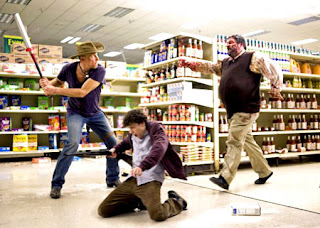 ake- up for characters such as werewolves, vampires and zombies. There is a difference to the format of a horror film and a horror comedy film as the pattern of a horror film is standardized with the usual same antagonist and protagonist. As for a horror comedy their format is different as they use more than one antagonist and don’t stick to the same routine of having a final girl and a monster fodder.
 ake- up for characters such as werewolves, vampires and zombies. There is a difference to the format of a horror film and a horror comedy film as the pattern of a horror film is standardized with the usual same antagonist and protagonist. As for a horror comedy their format is different as they use more than one antagonist and don’t stick to the same routine of having a final girl and a monster fodder.
 Wednesday, January 19, 2011
Case study of Dark Knight promotional material


http://www.youtube.com/watch?v=8jqq4j52Fb4
This is the magazine cover promoting the Batman franchise; and the Dark Knight Film poster. They both represent synergy to the promotional package. They do this by using the same colour scheme which is dark and gloomy colours. In both they also use the same main character which is the Joker. They portray him as being run down and glaring at the camera; this gives off a sense of horror within the two pictures. The trailer also uses the same colour scheme by using dark colours within the clip. They use colours such as green, black and blue which is a consistent colour scheme as shown on all types of the Batman’s global advertising. One of the main characters, the Joker is also shown in the trailer to be the main attraction which both the magazine and film po
 ster try to be their icon. The trailer uses phrases and sentences from the Joker within the film to narrate the story of the trailer, which shows how big of a part he plays. The magazine cover was not able to use the Dark Knight logo as it was seen as copyright, but the film poster and the trailer was legally able to use the logo to promote the franchise.
This is the magazine cover promoting the Batman franchise; and the Dark Knight Film poster. They both represent synergy to the promotional package. They do this by using the same colour scheme which is dark and gloomy colours. In both they also use the same main character which is the Joker. They portray him as being run down and glaring at the camera;
 this gives off a sense of horror within the two pictures. The trailer also uses the same colour scheme by using dark colours within the clip. They use colours such as green, black and blue which is a consistent colour scheme as shown on all types of the Batman’s global advertising. One of the main characters, the Joker is also shown in the trailer to be the main attraction which both the magazine and film po
 ster try to be their icon. The trailer uses phrases and sentences from the Joker within the film to narrate the story of the trailer, which shows how big of a part he plays. The magazine cover was not able to use the Dark Knight logo as it was seen as copyright, but the film poster and the trailer was legally able to use the logo to promote the franchise.
Friday, January 14, 2011
A2 Trailer Research: Dark Knight
http://www.youtube.com/watch?v=8jqq4j52Fb4
Micro features
This trailer starts differently to the High school musical trailer as it promotes the company’s name and brand. This trailer also starts off with fades at the start; it then gets faster with the editing speeding up. As the trailer goes on there is a lot of location shots to show Gotham city which is the setting of the trailer. There is a diegetic voice over of the Joker within the clip which tells the story and gives off a psychotic feel about the clip. The lighting within the clip is very low key to portray the horror genre within the trailer. The colour scheme within the scene is black and very dark to show off the batman image. The joker says in the clip: ‘Why so serious’, which is the slogan for the joker. This shows off the batman franchise and also gives a sense of horror within the trailer.
Macro features
The antagonist, which is the joker, looks run down to madness; this makes the trailer more gripping as the viewer would want to find out why he has become like that. The edits start to get quicker towards the end of the film to build tension within the film and to make the trailer seem more exciting. The edits reach up to roughly 69 edits which is a lot of edits. The hook within the clip is to keep viewers thinking what happens between Batman and the joker in the film. They don’t film it in more than one place as there are different locales within Gotham city.
Micro features
This trailer starts differently to the High school musical trailer as it promotes the company’s name and brand. This trailer also starts off with fades at the start; it then gets faster with the editing speeding up. As the trailer goes on there is a lot of location shots to show Gotham city which is the setting of the trailer. There is a diegetic voice over of the Joker within the clip which tells the story and gives off a psychotic feel about the clip. The lighting within the clip is very low key to portray the horror genre within the trailer. The colour scheme within the scene is black and very dark to show off the batman image. The joker says in the clip: ‘Why so serious’, which is the slogan for the joker. This shows off the batman franchise and also gives a sense of horror within the trailer.
Macro features
The antagonist, which is the joker, looks run down to madness; this makes the trailer more gripping as the viewer would want to find out why he has become like that. The edits start to get quicker towards the end of the film to build tension within the film and to make the trailer seem more exciting. The edits reach up to roughly 69 edits which is a lot of edits. The hook within the clip is to keep viewers thinking what happens between Batman and the joker in the film. They don’t film it in more than one place as there are different locales within Gotham city.
A2 Trailer research: High School Musical 3
http://www.youtube.com/watch?v=-LepPGcEnDw
Micro features
Throughout the trailer of High School Musical they use one transition consistently which is fades. The fades are used mostly at the start of the clip, but as the clip progresses the edits get quicker and the fades stop and it is just consists with constant cuts to the end of the clip. The edits get quicker so that it builds up tension within the trailer. There are 83-93 cuts or edits within the clip. The quick edits are cuts that show a montage of different shots of different characters within the film. It also cuts to different scenes of the film to move the narrative on within the trailer and to show the viewer what the story is about. The lighting is high key to show the viewer what genre of film it is for example: A low key lighting film would most likely be a horror or a thriller film.
Macro features
Each clip is in a different location to move the narrative on but not give away too much about the film. They change the setting through each clip so it doesn’t look boring. The genre of the film is a musical; I know this because the trailer contains bright primary colours and the cast constantly break into song when something big happens in the storyline. The target audience for this trailer is for tweens, which are the age range of 11-13. This is an emerging target market because up until recently tweens didn’t exist. The teenage romance and singing attracts the tweens audience as it is put across in a more child-like manor. High school musical is also part of a franchise so they will have attracted the audience with their other films.
Micro features
Throughout the trailer of High School Musical they use one transition consistently which is fades. The fades are used mostly at the start of the clip, but as the clip progresses the edits get quicker and the fades stop and it is just consists with constant cuts to the end of the clip. The edits get quicker so that it builds up tension within the trailer. There are 83-93 cuts or edits within the clip. The quick edits are cuts that show a montage of different shots of different characters within the film. It also cuts to different scenes of the film to move the narrative on within the trailer and to show the viewer what the story is about. The lighting is high key to show the viewer what genre of film it is for example: A low key lighting film would most likely be a horror or a thriller film.
Macro features
Each clip is in a different location to move the narrative on but not give away too much about the film. They change the setting through each clip so it doesn’t look boring. The genre of the film is a musical; I know this because the trailer contains bright primary colours and the cast constantly break into song when something big happens in the storyline. The target audience for this trailer is for tweens, which are the age range of 11-13. This is an emerging target market because up until recently tweens didn’t exist. The teenage romance and singing attracts the tweens audience as it is put across in a more child-like manor. High school musical is also part of a franchise so they will have attracted the audience with their other films.
Friday, July 16, 2010
Research into magazine posters

Case study: Empire magazine- Dark Knight
The denotation of the poster is of one of the main characters from the film The dark knight. The character is the joker, who is wearing face paint to make him look like a clown. It has the title of the magazine above his head and the name of the film they are trying to advertise. It also shows the left side first which mentions the article that are in the magazine. The connotations of the magazine cover are of the Star character Heath Ledger wearing clown make up and it gives off a sense of insanity as he is glaring up at the camera with his head down and the camera tilted down on him. The icon in the cover is the Joker because as soon as you see that face you know it is the Batman franchise. The signifier of the cover is the horror it represent through the Jokers insane glare at ther camera. Empire magazine released two covers of this magazine so the audience could pick whether they related better with the Joker or with Batman. The colour of the font is green which is the theme colour to what the Joker wears throughout the film. The font also matches the Jokers hair colour because for the film his hair is died green. Underneath the Masthead it says 'Batman vs The Joker summer just got serious' which is the tag line. This is a symbolic link to the catchphrase that the Joker uses in the film The Dark Knight which is 'Why so serious'. The left hand first also promotes other films like Hancock, The Hobbit and The real jaws.

Case study: Empire magazine- Megan Fox
The denotation of the film is the main attraction which is Megan Fox. She is wearing no top and a pair of tight trousers so it attracted many male readers. It has the title of the magazine above her head and they are advertising what is in the magazine, which is an interview with Megan Fox and her sexual attraction. It shows the left side first which says what that weeks magazine will contain. The connotation of the magazine is the star character Megan Fox, who is trying to promote her sexual image and attract many male readers just by her sitting down glaring at the camera showing a lot of flesh. The icon within the magazine is megan fox as she is portrayed as a sexual icon. Megan fox signifies a sort of sexual woman and symbolises sexy young women actors. The theme colour of the magazine is white which symolises virginity, so it contrasts with what Megan Fox is wearing, or isnt wearing. The Font size is bold and in capitals to catch the readers eye. Megan Fox's name is in bold so the first thing peoploe read is about the main attraction, which is her. The left hand first promotes other exclusives in the magazine which is: Wolverine, Star Trek and Angels and Demons.
Wednesday, July 7, 2010
Research in to existing posters

Case study: The Strangers
The denotation of the poster is there are three people standing with masks on, and there are a couple tied to a chair next to each other. The connotations of the poster is that the couple will probably be brutally murdered by the people in the masks. The icon in the poster is the masks as it hides their identity. The anchorage of the film is the title 'The Strangers' as the people in masks are strangers because you cant see who they are. The signifier of the film poster is the three people wearing masks as it portrays horror to the audience as their identities are hidden. The poster also keeps the audience on edge about what the people in the masks are going to do to the couple tied up in the chairs. The back ground to the poster is very dark so it is obvious the film is a horror. There is only a bit of light on the poster to show the people wearing the masks. There are the names of the two main actors who star in the film and they are 'Liv Tyler' and 'Scott Speedman'. On the poster the 'Liv Tylers' name comes first before 'Scott Speedmans', this is because 'Liv Tyler' is the bigger actor between them both. This is called Star billing; this is when the most famous actors name comes first on a poster.
The denotation of the poster is there are three people standing with masks on, and there are a couple tied to a chair next to each other. The connotations of the poster is that the couple will probably be brutally murdered by the people in the masks. The icon in the poster is the masks as it hides their identity. The anchorage of the film is the title 'The Strangers' as the people in masks are strangers because you cant see who they are. The signifier of the film poster is the three people wearing masks as it portrays horror to the audience as their identities are hidden. The poster also keeps the audience on edge about what the people in the masks are going to do to the couple tied up in the chairs. The back ground to the poster is very dark so it is obvious the film is a horror. There is only a bit of light on the poster to show the people wearing the masks. There are the names of the two main actors who star in the film and they are 'Liv Tyler' and 'Scott Speedman'. On the poster the 'Liv Tylers' name comes first before 'Scott Speedmans', this is because 'Liv Tyler' is the bigger actor between them both. This is called Star billing; this is when the most famous actors name comes first on a poster.

Case study: UP
The denotation of this film poster is there is an old man a dog, a little boy holding onto a rope which is being supported by the house. The house is in the air flying up because it is attached by lots of balloons. The connotations of the poster are that they look like they are going on a mad adventure. The poster gives off a sense of youth vs. old age as it is an old man doing flying in the air on balloons. The icon of the film is the balloons as it shows a fun side of the film. The signifier of the film is the flying house and the people hanging from it as it signifies a fun side to the film and it gives the audience a feel that there is a sense of panic. It gives off the sense of panic through the old mans facial expressions as he is hanging off his house with a worried look to his face. On the other hand the boy is laughing while hanging off the house so this portrays humour within the film. The poster try’s to attract a younger audience by using lots of primary colours. The poster also advertises the brand of the company that made the film which is Disney Pixar. There is none of the actor’s names who took part in the film on the poster because they believe that the property of the film is more important.
The denotation of this film poster is there is an old man a dog, a little boy holding onto a rope which is being supported by the house. The house is in the air flying up because it is attached by lots of balloons. The connotations of the poster are that they look like they are going on a mad adventure. The poster gives off a sense of youth vs. old age as it is an old man doing flying in the air on balloons. The icon of the film is the balloons as it shows a fun side of the film. The signifier of the film is the flying house and the people hanging from it as it signifies a fun side to the film and it gives the audience a feel that there is a sense of panic. It gives off the sense of panic through the old mans facial expressions as he is hanging off his house with a worried look to his face. On the other hand the boy is laughing while hanging off the house so this portrays humour within the film. The poster try’s to attract a younger audience by using lots of primary colours. The poster also advertises the brand of the company that made the film which is Disney Pixar. There is none of the actor’s names who took part in the film on the poster because they believe that the property of the film is more important.
Subscribe to:
Posts (Atom)


