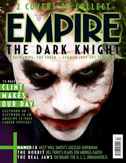
Case study: Empire magazine- Dark Knight
The denotation of the poster is of one of the main characters from the film The dark knight. The character is the joker, who is wearing face paint to make him look like a clown. It has the title of the magazine above his head and the name of the film they are trying to advertise. It also shows the left side first which mentions the article that are in the magazine. The connotations of the magazine cover are of the Star character Heath Ledger wearing clown make up and it gives off a sense of insanity as he is glaring up at the camera with his head down and the camera tilted down on him. The icon in the cover is the Joker because as soon as you see that face you know it is the Batman franchise. The signifier of the cover is the horror it represent through the Jokers insane glare at ther camera. Empire magazine released two covers of this magazine so the audience could pick whether they related better with the Joker or with Batman. The colour of the font is green which is the theme colour to what the Joker wears throughout the film. The font also matches the Jokers hair colour because for the film his hair is died green. Underneath the Masthead it says 'Batman vs The Joker summer just got serious' which is the tag line. This is a symbolic link to the catchphrase that the Joker uses in the film The Dark Knight which is 'Why so serious'. The left hand first also promotes other films like Hancock, The Hobbit and The real jaws.

Case study: Empire magazine- Megan Fox
The denotation of the film is the main attraction which is Megan Fox. She is wearing no top and a pair of tight trousers so it attracted many male readers. It has the title of the magazine above her head and they are advertising what is in the magazine, which is an interview with Megan Fox and her sexual attraction. It shows the left side first which says what that weeks magazine will contain. The connotation of the magazine is the star character Megan Fox, who is trying to promote her sexual image and attract many male readers just by her sitting down glaring at the camera showing a lot of flesh. The icon within the magazine is megan fox as she is portrayed as a sexual icon. Megan fox signifies a sort of sexual woman and symbolises sexy young women actors. The theme colour of the magazine is white which symolises virginity, so it contrasts with what Megan Fox is wearing, or isnt wearing. The Font size is bold and in capitals to catch the readers eye. Megan Fox's name is in bold so the first thing peoploe read is about the main attraction, which is her. The left hand first promotes other exclusives in the magazine which is: Wolverine, Star Trek and Angels and Demons.

No comments:
Post a Comment